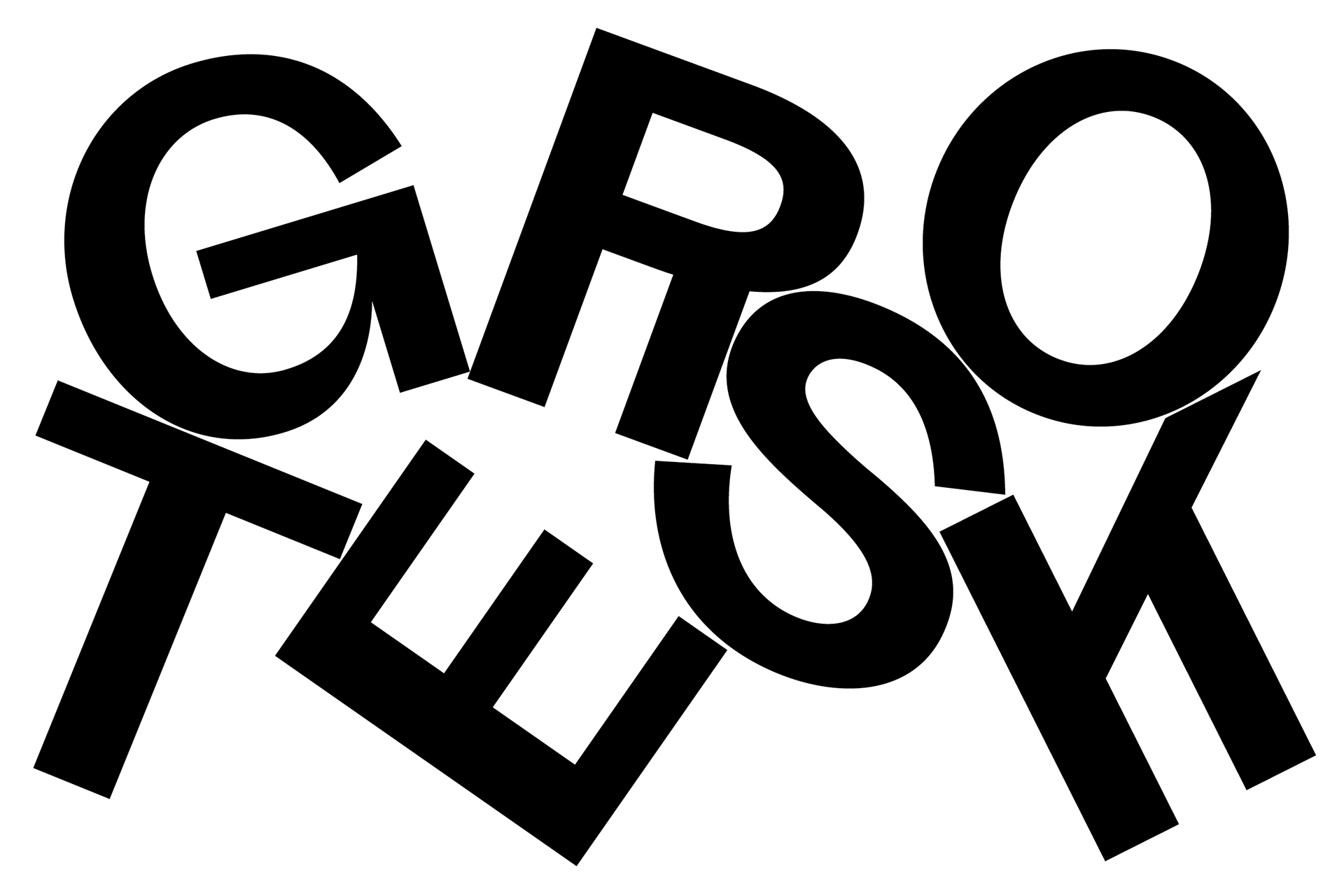
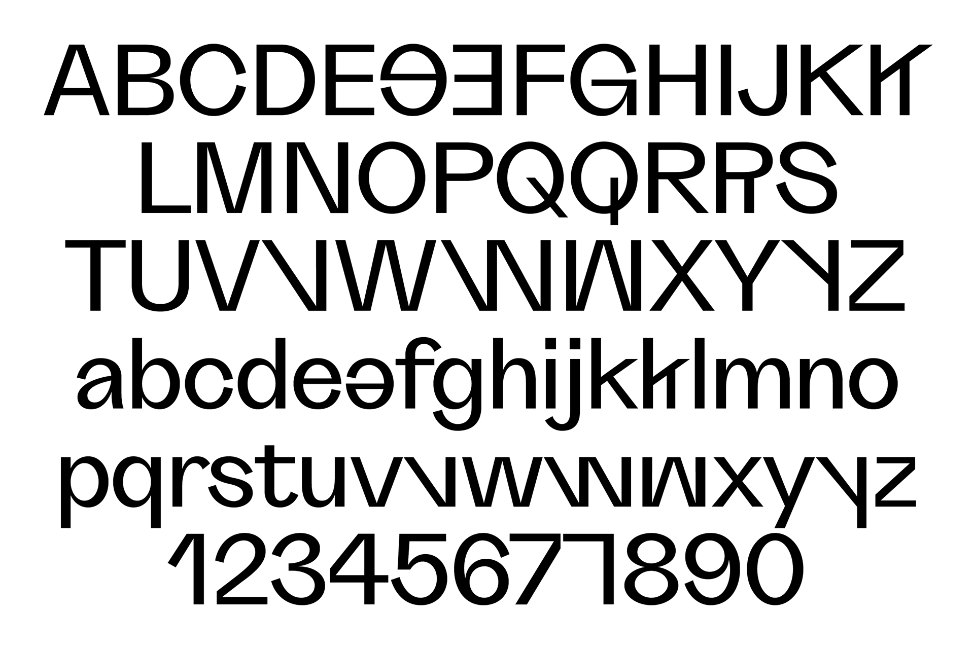
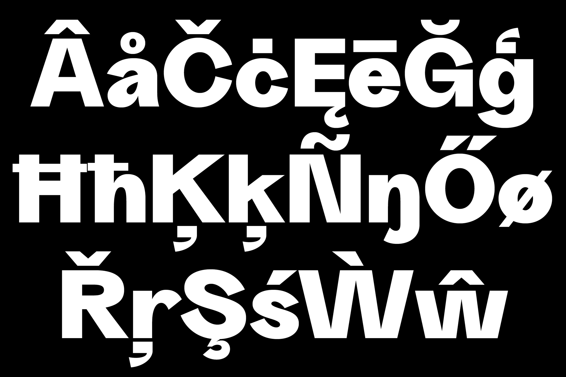
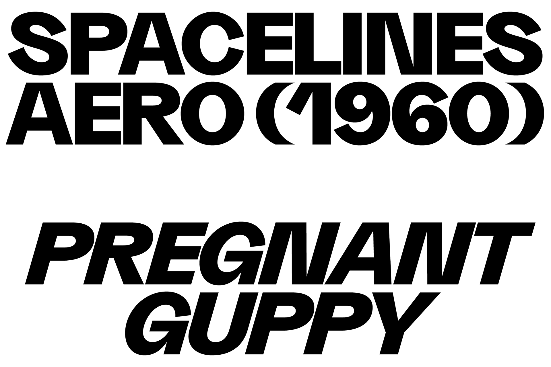
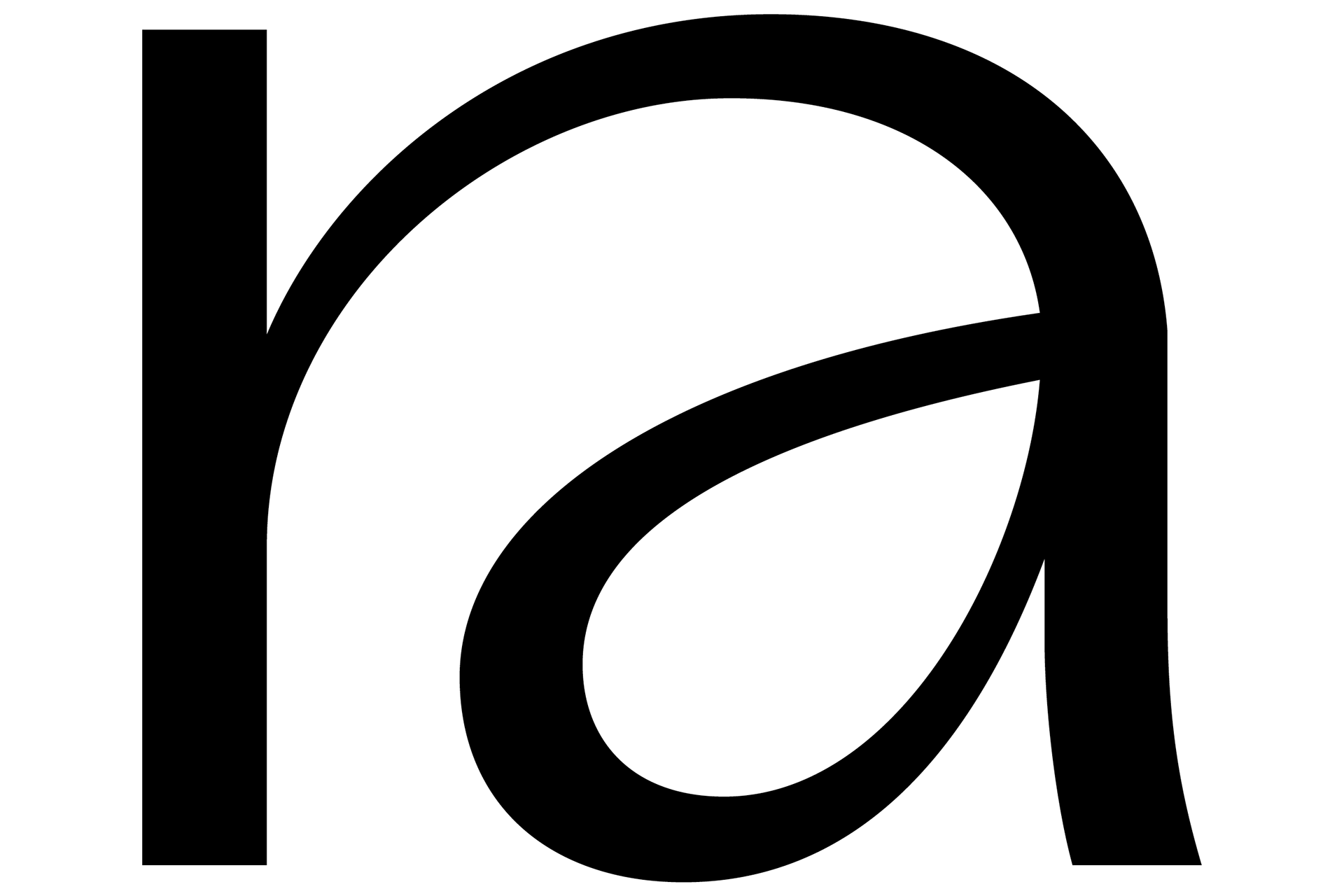
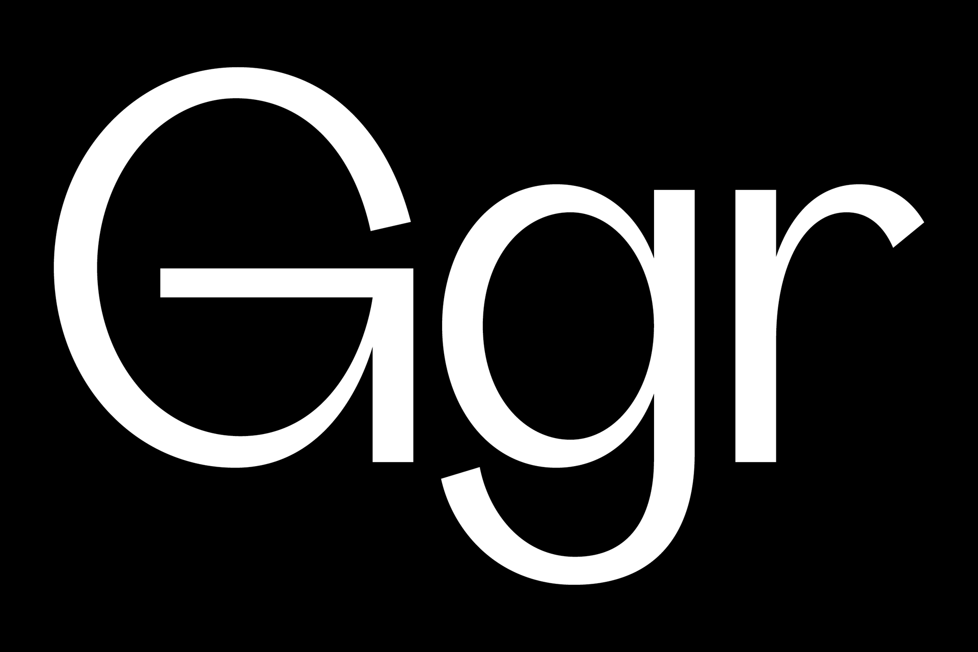
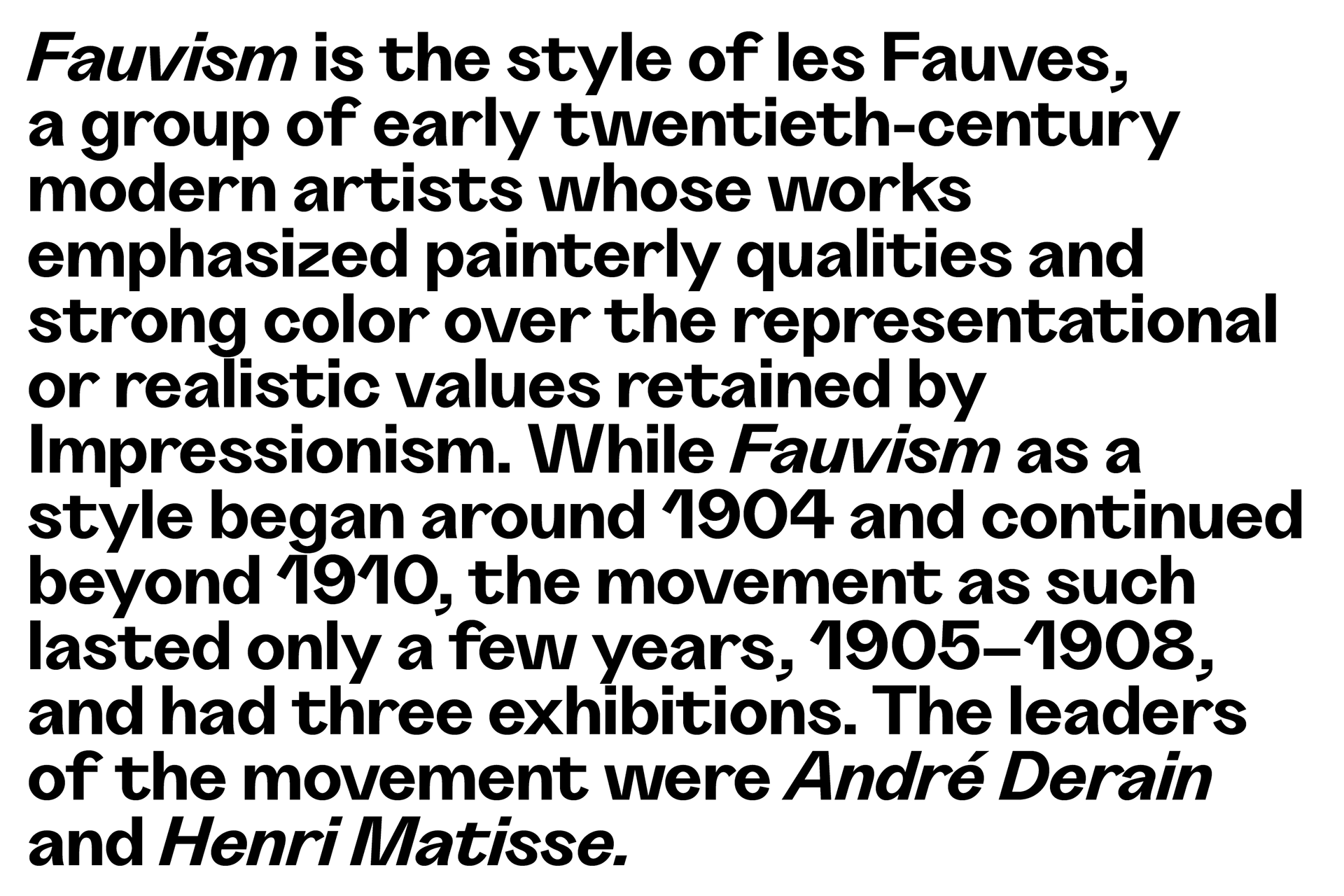
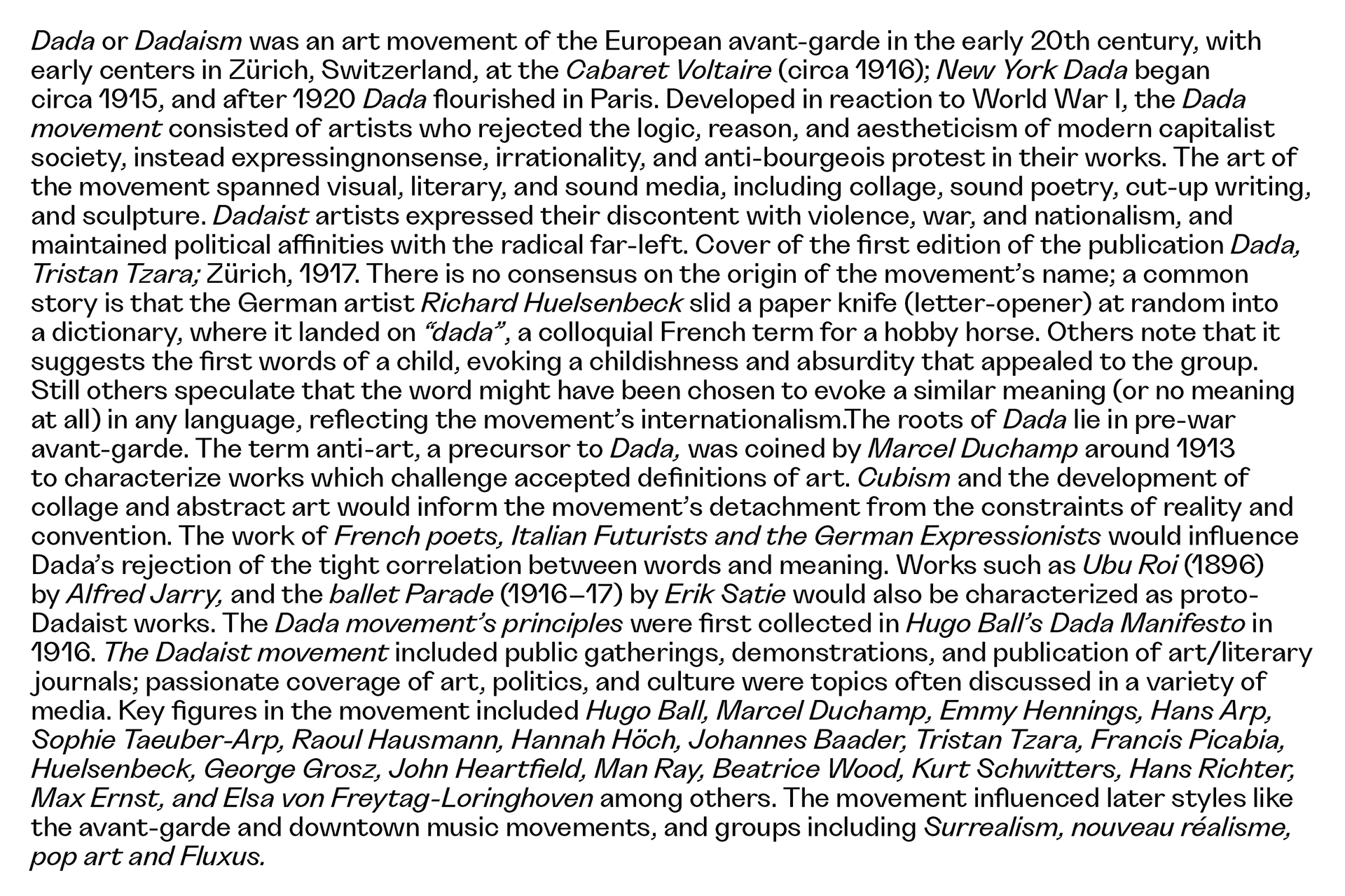
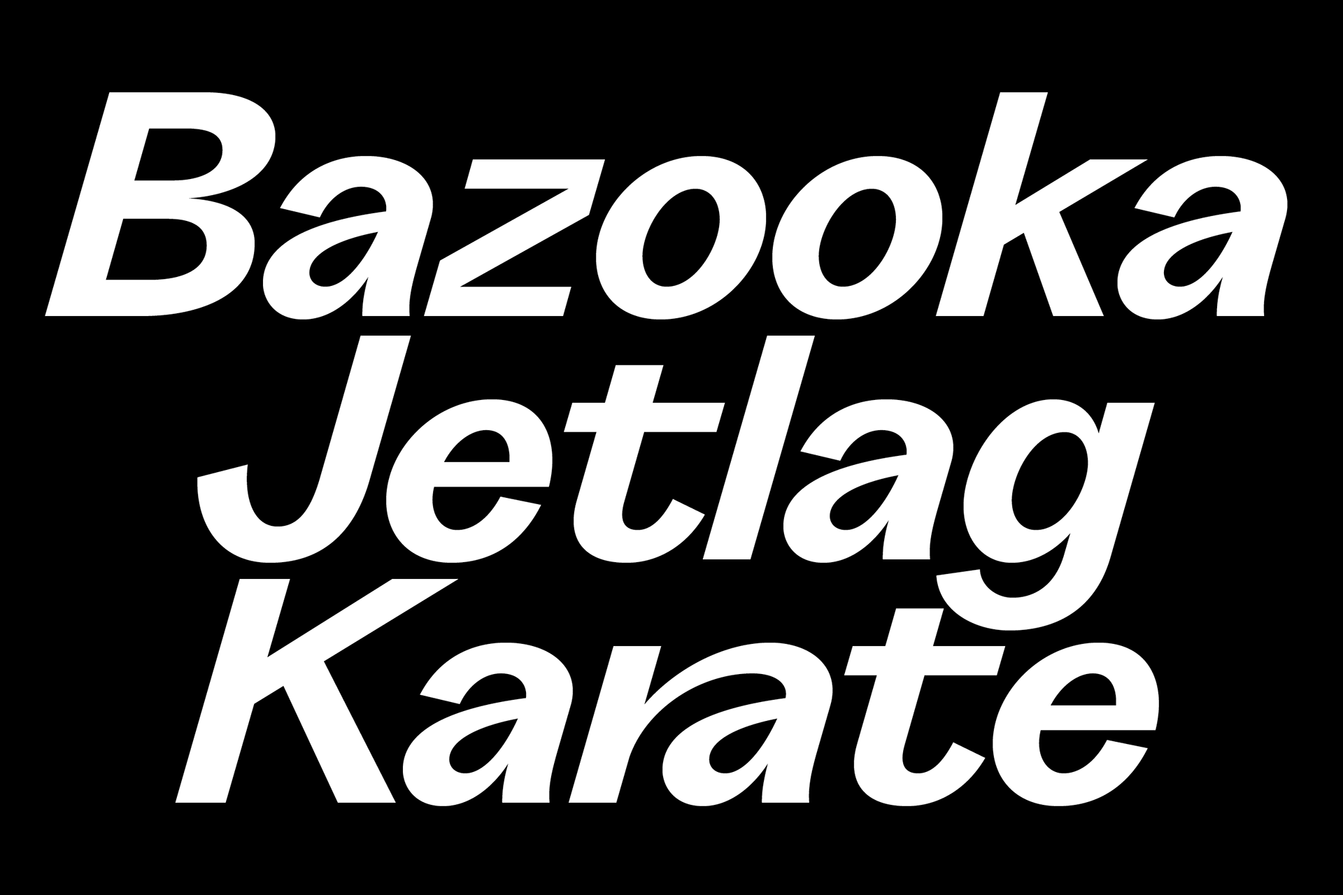
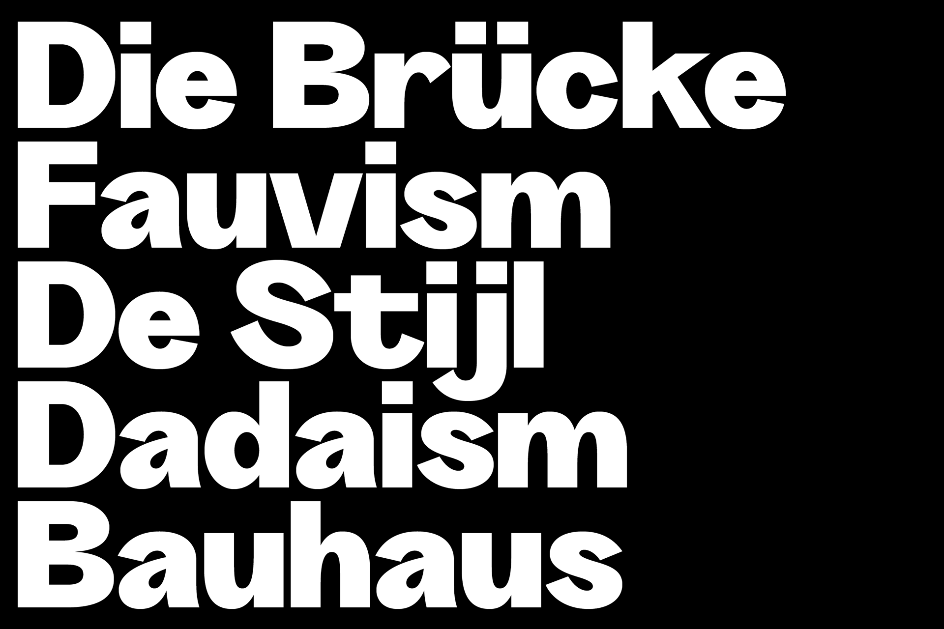
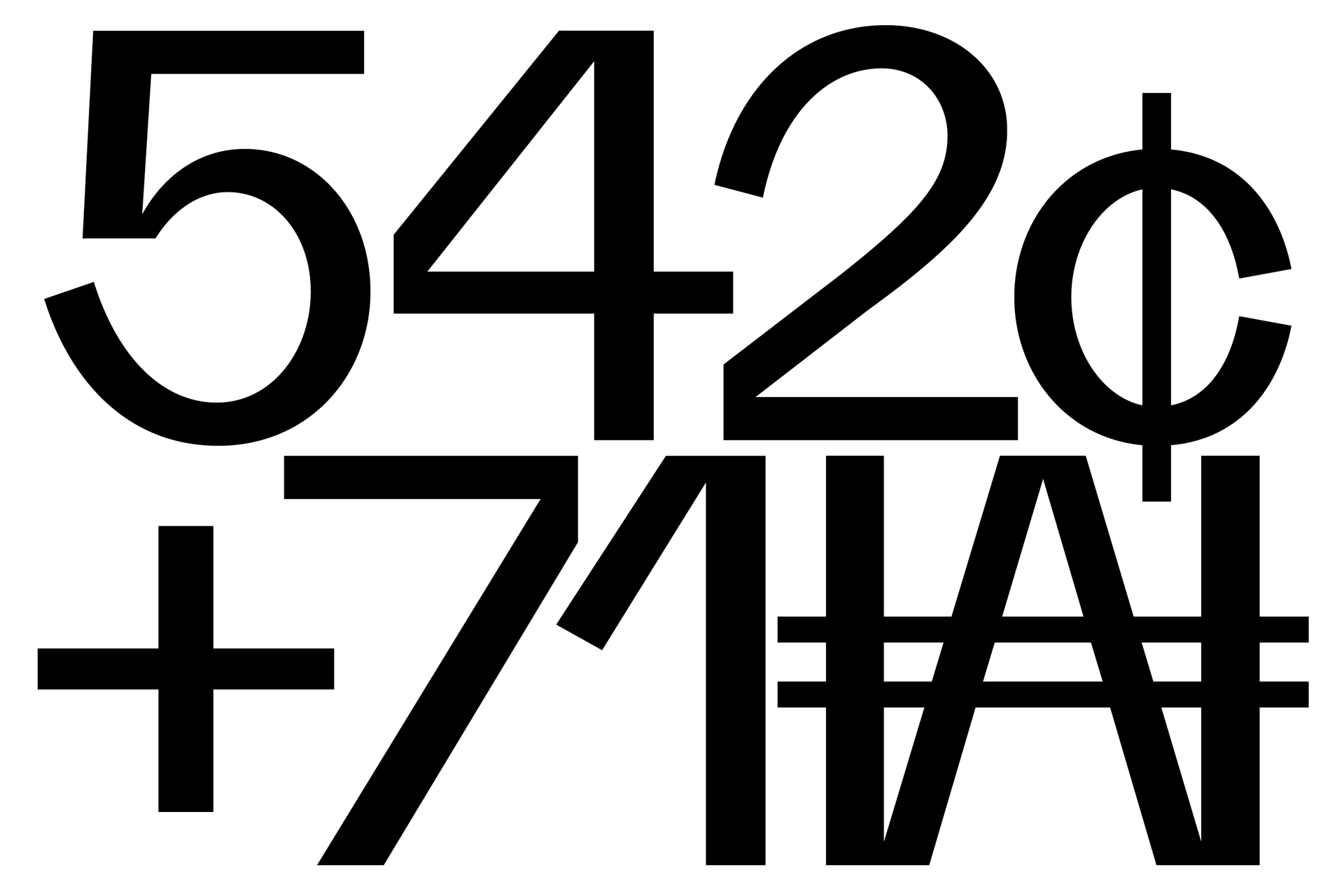
Characterized by tight apertures and an overall dynamic feeling it is suited for both display and text sizes. It is our interpretation of the 21st century grotesk, exuberant, irruptive and course that winks at the typeface from the past such as Venus-Grotesk and Monotype Grotesque. Provided with an extended language support anda wide range of OpenType features and stylistic set, Grotta is available in 7 weights from Light to Heavy with corresponding italics. The typeface has some special glyphs like the ə and the * on x-height and uppercase to make the use of gender-inclusive language a little bit easier. It also has some fancy ligatures!
It was developed at Due Studio with
Alessio Pompadura and Massimiliano Vitti,
who designed the Roman Letterforms from Light to Bold.
Amelie Schaeberle took part in designing the italics
and the weights Black and Heavy as an extension of the Grotta family.
The type family can be purchased on www.due-studio.com
